logo
LinkedIn
LinkedIn
  • Home
  • Capabilities
  • Industrial Design
  • Freehand Sketching
  • Digital Illustration
  • Graphic Packaging Design
  • Animation
  • Retail Displays
  • Rapid Prototyping
  • About Us
  • Location
  • Contact Us
  • Blog

Northland Hockey Stick Graphic Design

Published March 15, 2016 - size: 1200 × 900 in Northland Hockey Stick Graphic Design
← Previous Next →

 
Northland Hockey Stick USA | Graphic Design

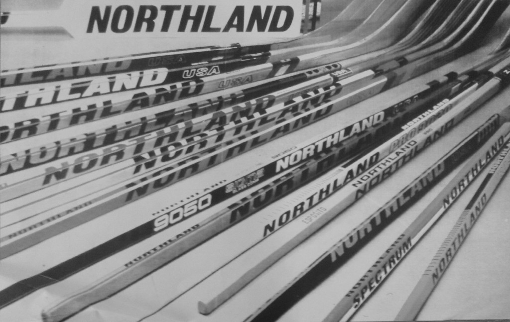
As a Staff Designer at DeBrey Design, Minneapolis, MN, I conceived of the idea of wrapping the “Northland” logotype around two sides of the hockey stick. To my knowledge, this was the first time ever that this had been done on a hockey stick. The result gives the optical illusion that the stick shaft itself is larger, beefier and stronger. Northland ownership embraced the idea and used the idea it across their new line of sticks.

Wrapping of the logotype across 2 or even 3 sides is now common practice on almost every brand of hockey stick since. :-).

 
nhs-img-008

 
A vintage photograph depicting some of the hockey sticks as they appeared in the Northland Hockey Stick lineup.
 
northland-hcky-stck-003


Trapezoid Design
Trapezoid Design
Trackbacks are closed, but you can

Leave a comment Cancel reply

Your email address will not be published. Required fields are marked *

Pages

  • Home
  • Capabilities
  • Industrial Design
  • Freehand Sketching
  • Digital Illustration
  • Graphic Packaging Design
  • Animation
  • Retail Displays
  • Rapid Prototyping
  • About Us
  • Location
  • Contact Us
  • Blog

Archives

  • February 2016
  • January 2016
  • May 2015

Categories

  • Uncategorized (3)

WordPress

  • Log in
  • WordPress

Subscribe

  • Entries (RSS)
  • Comments (RSS)